User Research
UX Case Study : Optimizing the Driver Earning Experience on Rapido Bike Taxi App
Rapido identified that captains(drivers) across India were struggling to understand their payouts and earnings, prompting a first-of-its-kind, company-wide UX initiative that resulted in a clearer, more accessible screen designs, influenced business strategy, and set a new standard for future research at Rapido.
DURATION:
6 weeks
SKILLS:
Stakeholder Interviews, Participatory Design, Remote Testing, Research Planning and execution, Analysis, Presentations to Stakeholders
MY ROLE:
I led the project in the
User Experience Research Team for this project
REGIONS: Chennai, Guwahati, Mumbai, Delhi
RESEARCHERS: Akshata Murdeshwar, Meenakshi Nagarajan

Rapido, a leading bike taxi platform in India, recognized that its captains (drivers) were facing challenges with understanding and using the app’s earnings features-particularly their earnings payout. Captains reported confusion and difficulty in discovering, comprehending, tracking, and redeeming their earnings. The diversity in captains’ educational backgrounds, language proficiencies, and regional contexts further complicated the user experience. We set out to address these pain points and improve captain satisfaction and trust in the platform.
-
The research led to a redesigned rate card that was smaller, clearer in terms of language, and more visually organized with less reliance on words, and supportive icons.
-
Insights from this project were also presented to upper management and influenced broader business strategy.
-
The study was the first of its kind in rapido and set the stage for all other research that followed as well as showcasing the abilities of the research for the other teams.
Research Goals
The overarching objective of this research would be to evaluate how captains perform key actions across the user journey of discovering, comprehending, tracking and redeeming their Earnings. Our secondary goal would be to understand our captains’ background and their perspective towards Rapido.
01
Evaluate how captains perform key actions related to their earnings journey (discovery, comprehension, tracking, redemption).
02
Identify usability pain points and expectations for the rate card, earnings home, and incentives features.
03
Gather actionable insights and user-driven recommendations to inform a redesign, ensuring the experience is accessible, clear, and supportive of captains’ needs across regions and backgrounds.
Research Questions
Primary questions
-
What, if any, role does the rate card play from a users’ perspective?
-
What expectations do users have for how a rate card should look like?
-
How do users view compare two variants of rate card?
-
How does the key terms in the incentive page impact users’ perception of incentives?
Secondary questions
-
Why do users join Rapido?
-
How do users compare Rapido vs. their competitors?
-
How does geography and language proficiency influence how people define ‘usability’ when it comes to the design of rate card?
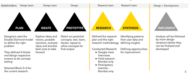
Research Methodology
Design Process
Double Diamond model for structured discovery, ideation, prototyping, and delivery.
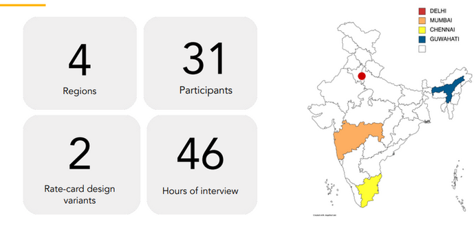
Interview Process
Interviews were conducted in 4 cities, with 31 captains (8 per region), aged 24–52, mix of part-time and full-time, average education 12th grade, household income 5K–30K INR.
This resulted in 46 hours of data.

We used a structured session flow conducted in a mix of remote and in-person fashion.
Various stimuli were shown with a think-out-loud method of narration. These were followed by discussions.
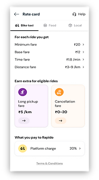
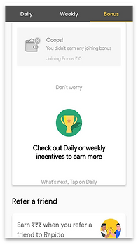
Stimuli
There were 3 stimuli. The current rate-card (which is a screen where the drivers can see what they are paid for), 2 new rate card variants to test, and a page that explains the incentives that drivers can earn.
01


02

03
Analysis
Each interview was audio recorded, transcribed and then placed on a digital colab board. Then affinity mapping was performed to find patterns and themes.
And we learned;

// A USEABLE RATECARD IS SMALL AND SIMPLE, ORGANISED, AND COMMUNICATES DETAILS RIGHT.
Findings and Insights


How did the variants fare?
The reception to the variants depended on the way the information was placed on the screen as well as the physical location


During the interview, some captains were asked to suggest what they thought could be btter. As the captain described it, I (the interviewer) sketched it out on paper.
Then this paper was shown to the captain and they were welcomed to make more changes until they were satisfied.

Participatory Design Activity with the Captains
IMPACT
Design Impact
-
The insights directly informed the next iteration of the rate card and incentives page, with a focus on usability and inclusivity.
-
The final design combined the visual clarity of Variant 1 with the explicit detail of Variant 2.
-
All key information is now accessible at a glance, with logical grouping and supportive icons.
Business Value
-
Enhanced captain trust and satisfaction, supporting retention and platform loyalty.
-
The project established a replicable research process for future UX improvements and highlighted the importance of ongoing user feedback, especially in regions with diverse linguistic and educational backgrounds
Next Steps
-
Limitations:
-
Regional language rollout was limited due to time constraints.
-
-
Next Steps:
-
Conduct card sorting to validate the “Rate Card” title versus alternatives.
-
Run a longitudinal study to assess the long-term impact on captain satisfaction and retention.
-
Expand usability testing to more regions and languages.
-